Friday, August 30, 2013

a start on a December Daily mini album...

It's mini album week on the Pink Paislee blog, and I had fun with the Snow Village line. Wanted to get a little start on my December Daily, so I'll share a few pages I've started in it. I'll keep working on it... and add, add, add!

I LOVE making mini albums. Mostly because I enjoy mixing and matching colors and patterns, and love adding texture...and mini albums are a great way to add tons of texture to a project (and lots of photos)!

I've used the Artisan 4x8" covers for the front and back and just made my own inside pages, some of them are the Artisan tab pages that go in the album, and some of the pages are just ones I made myself with patterned paper, cardstock, stamps, journaling cards, etc. On the front, I painted with white acrylic paint, added some Artisan ribbon sprayed with Heidi Swapp's Color Shine in Chartreuse. Then added some of the Snow Village canvas stickers, clear stickers and chipboard. I used Heidi's Black Velvet Color Shine to sprinkle on a few drops of black on the front.

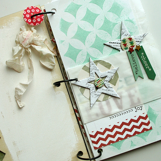
On the first inside page spread, I decided to paint the inside back of the cover and leave it open for photos. I added a paperclay button I made myself (video for that is on my blog) and a piece of scrunched seam binding. On the other side, I used an Artisan paper and rubbed it with stamping ink, a color called Aqua Mist by Papertrey Ink. It's such a pretty teal and goes perfectly with this line!

One thing I love to do in my minis is add lots of things to turn and flip! I added little glassine bags to house little photos (wallet size) and also added journaling cards to write on - they are not attached to the pages, they are loose and just hooked onto the rings. This way you can enjoy the front and the back of them.

You could certain journal on the back of some of these cards... or add photos!


On the second page spread, I used another Artisan paper on the right and rubbed it with a gray stamping ink called Soft Stone by Papertrey Ink. It really brings out the pretty circles. I added a collage paper from Snow Village on the left side.

A half-doily dresses up the glassine bag with a felt snowflake, Snow Village chipboard and some Artisan stars. I have inked a few of them up with red ink. The blue snowflake is from the Snow Village clear stickers.

The third page spread is stamped on the left with the Snow Village stamps. Added some Artisan ribbon sprayed with Heidi Swapp's Color Shine like I did on the front cover and a big striped ribbon from my stash.


On the fourth page, I have cut some of the patterned paper for the left, added a clear snowflake sticker to the top, a flower chipboard and an Artisan Element circle over the top! Oh, see the little label underneath? Those are new from the Sentiments Series line!

On the right are lots of journaling cards again, a glassine bag and a scalloped vellum banner.

I've got more to add for sure, but I'll stop there for today! Hope you gained some ideas for your next mini album.

Pink Paislee products used: Snow Village collection, Artisan collection, Luxe collection, Sentiment Series. Other: Heidi Swapp's Color Shine - Chartreuse and Black Velvet, glassine bags, ribbon, stamping inks by Papertrey Ink in Aqua Mist and Soft Stone, paperclay button, and seam binding.

Tuesday, August 27, 2013

Studio Calico's September card kit...

Studio Calico's kits are being revealed today and are available for presale... here are some things I made with just the main card kit only. (We didn't get those Pebbles word stickers in time for our kit, so they are not included in my projects.)

The first one was stamped with the big spiral...doesn't it remind you of the older Spirograph game? I remember countless hours making images like this with my Spirograph! I popped up some of the red swirls and the banner for dimension.

Those little enamel dots finish off the centers nicely.
Here I used the lace stamp with Fine Linen, Classic Kraft and Dark Chocolate inks to create an ombre effect. I was feeling in an autumn mood that day!

You can create a little card set by using the same background and just switching up the sentiments. I'm not a big fan of "flat" cards, so I stamped the sentiment one more time, cut it out and popped it up for dimension.
The little flag stamp makes a cute banner.
I added stitching to make the little banner look more "real". This one would be cute with a birthday sentiment too.
A simple one here highlighting the pretty patterned paper...


On the Merci card, I punched the leaves from several papers and stitched them back together with my machine to add lots of patterns to the card. The dot in the background was created with an older Cuttlebug embossing folder. I've used that one a lot in the past, and had to bring it back out again!

(I was inspired by this card made by Melissa Phillips, although I know mine does not do hers justice!)
Last a little shaker card. I cut out the center and added acetate to the front piece, then filled it with punched circles and hearts. The heart is a stamp. To make these patterned paper hearts, I stamped the heart on the back of the papers and cut them out.


I had so many more ideas, but alas...I ran out of time to work on more cards. I also received the Bubblegum add-on kit, so if I get time here in the next few days, I will post more cards made with that one too. Grab one of the Double Scoop kits today while they are still available.


Sunday, August 25, 2013

Papertrey Ink's August blog hop...

Don't forget to take part in the Papertrey Ink blog hop this month! Here is just one of the color combos you can use, but there are more on Nichole's blog to choose from.
I also wanted to thank you all for a lovely time yesterday at Stamp-a-Faire and your nice comments on my blog posts. It's been a lot of work, but so much fun too. I'm so sad it's over. It went by fast, didn't it? Thanks again for all your support, hope you were inspired to make something fabulous. I'll be doing more videos in the future now that I've got a few under my belt. I appreciate your kind words! Have a good day.


Saturday, August 24, 2013

10pm EST: "Recipe remix"

Earlier in the week, Papertrey Ink customers posted projects they have created in the past that they felt needed just a *little* something. Each design team member will select a project to remix to and re-make the project, making changes that they feel benefit the project. We'll discuss what design "rules" we used or why we made the changes we did. 

Here is the card I chose to remix... #27 by Kim Heggins.
The reason I chose this card to work with is because I love, love the products she chose to put together! The Sweet Life flowers are one of my favorites, combined with the Bountiful Banners and the Mat Stack 6 dies, she did a really nice job combining these products! And the colors too - really, really pretty color combo. Love it!

So, I took out my dies and stamps...all of the same dies and stamps she used on her card. I was already inspired! I went to work and this is what I came up with:


I decided first that I wanted my flowers and leaves to be the focal point of the card. I really wanted them to stand out from the background. So I changed the leaves to green, that was my first step...stamping three of the large leaves in New Leaf ink and Ripe Avocado ink for the leaves' centers. 

Next, I changed the color of the flowers to Harvest Gold ink and accented them with Canyon Clay ink. I love the yellow and orange with the darker green! The darker leaves with the lighter flowers adds a lot of contrast to the card. Contrast adds more interest to the eye. 


I decided to do two flowers instead of three, and make one flower smaller and one larger. Again to add more interest. If they are not all the same size, shape and color, it's a little more pleasing and exciting to the eye. Adding different heights and shapes helps the design become more exciting! Then placing the leaves in a triangle brings your eye around the pretty focal point.

Another thing I wanted to try a little differently is change the position of the card to vertical instead of horizontal. The reason for this is because the frame is very horizontal. To break up the horizontal lines and add another interesting detail, I wanted to create a vertical line also. Making the card base vertical helps break up those horizontal lines. (Here's a quick tip: this is how I score my cards for folding - with my paper trimmer and scoring tool.) 


I changed the frame to Soft Stone cardstock (gray). I thought we needed one more color that went with green, yellow and orange. I'm loving gray with yellow and orange right now. I decided to add another layer onto the frame. I felt like the big frame just needed a little something, but adding another layer just smaller grounded the flowers a bit. 
Speaking of "grounding", I brought the banner up and adhered it closer to the frame to keep it grounded to the rest of the design also.

A huge thank you to Kim for letting me work with her card! I appreciate it so much, and I hope she likes what I did.


Happy Birthday card:
STAMPS: The Sweet Life, Bountiful Banners
INK: Harvest Gold, Canyon Clay, New Leaf, Ripe Avocado, True Black inks
PAPER: Canyon Clay, Soft Stone, White
DIES: The Sweet Life, Bountiful Banners, Mat Stack 6
OTHER: pearls by Melissa Frances.

9pm EST: "Sweet sugar coated embellishments"

I have another video to share with you, this time on making your own Sugar Coated Embellishments for your cards and projects. I am working with the Wonderful Words: Holiday dies and will show tips and techniques to adding fun glittery stripes and polkadots to dress up your die cuts!

You'll need:
1. some words die cut out of cardstock,
2. Ultra Fine Prisma Glitter and
3. 1/8" Scor Tape to create the striped effect you see here on this "peace" word on my holiday card set.


I've prepared a video for you showing my technique. I think it will be easier to explain by showing you instead of just pictures!


Let me know if you have any questions. Hope you've enjoyed Stamp-a-Faire so far!


Peace Be Still cards:
STAMPS: Peace Be Still, Mistletoe & Holly, Bountiful Banners, Think Big Favorites #9
INK: Soft Stone, Sweet Blush, True Black, New Leaf, Pure Poppy
PAPER: Soft Stone, Rustic White
DIES: Wonderful Words: Holiday, Bountiful Banners, Mistletoe & Holly
OTHER: Ultra Fine Prisma Glitter, 1/8" ScorTape, Martha Stewart Glue Pen.

4pm EST: "Custom accents from the oven"

Let me show you how to make customized rings for any occasion or holiday with shrink plastic and your stamps from your stash! It literally only takes about 5 minutes to make one once you've gathered all of your supplies. You can make about 16 rings from one 8.5" x 11" sheet of shrink plastic.

Supplies:
An oven and baking sheet, one piece of vellum, brown craft paper to fit on your baking sheet, shrink plastic, stamps of your choice, scissors, permanent inks, sandpaper, round handle like a makeup brush for forming the rings.

Instructions:
1. Trim a strip of shrink plastic approximately 4.5" or 5" x 3/4" for each ring. (Play around and practice making these to find the exact length you need to fit on your finger.)
2. Choose a stamp(s) to decorate your ring with. Stamp a design onto the strip with permanent inks. I would recommend only doing one or two in the oven at a time. (See video.) They cool off and harden too quickly to do more than two at a time.
3. Cover the strips with a large piece of vellum. The vellum will hold the shrink plastic down a bit to prevent the strips from curling too much and getting stuck together. Put stamped strips into the oven at 350 degrees for 3 minutes.
4. Take out immediately. You'll need to work fast. Remove vellum. Wrap each strip of shrink plastic around a handle of some sort, such as a makeup brush, to form the ring shape. Be careful, as it is hot! Wear a plastic glove if you can to protect your fingers.
5. Sand all edges of ring to make it smooth and more round.

I've made a video to show you the process.


Hope you've enjoyed this technique, they are so easy and fun to make. I'm imagining these in cute little glassine bags all prettied up for the holidays. OR as little birthday treats for party goers to take home with them. Have fun and please leave me a note if you give this a try. I'd love to hear from you. Happy stamping!


Shrink Plastic Rings:
STAMPS: Peace Be Still, Tag Its #4
INK: Permanent StazOn ink in Metallic Silver and Blazing Red
PAPER: none
DIES: none
OTHER: Shrink plastic, vellum, brown craft paper or parchment paper, baking sheet and oven, sandpaper, round handle such as a makeup brush.

3pm EST: "Gallon:Quart:Pint Color Challenge"

Here is your next challenge, Stamp-a-Faire goers!

Select a color scheme from your recipe box and incorporate the "gallon/quart/pint principle". I chose to use Aqua Mist, Enchanted Evening and Pure Poppy colors by Papertrey Ink for my card.
As you can probably tell, Aqua Mist is the "gallon". It's the color I used the most of with the background and stamped lines from Teacher Tickets. The second most used color is Enchanted Evening, so that is the "quart" color. I stamped two apples, the sentiment and used twine in the darker blue color. The "pint" color is the least used on my card, which is Pure Poppy. Even though there is only a bit, I think it stands out the most, don't you?
Neutrals actually don't count as a color, so the die cut numbers in white don't count. I had fun stacking the numbers die cut with the By the Numbers Border Die. I was inspired by this stacked number project life card (scroll down to the black numbers) I saw on Pinterest. Well, I can't wait to see your take on the "Gallon/Quart/Pint" challenge. Have fun!


Back 2 School card:
STAMPS: Teacher Tickets stamps (line), Back To School stamps (apples and sentiment)
INK: Pure Poppy, Aqua Mist, Enchanted Evening and New Leaf inks
PAPER: Aqua Mist and white cardstock
DIES: By the Numbers Border dies, Back To School dies
OTHER: pearls by Melissa Frances, twine by The Twinery, machine stitching.